A nutrition data revolution
The 2014 Global Nutrition Report called on governments and donors to invest more in a nutrition data revolution to ensure accountability. Without appropriate nutrition data, governments can’t make decisions to push forward country nutrition agendas and progress can’t be effectively monitored to support action and ensure accountability.
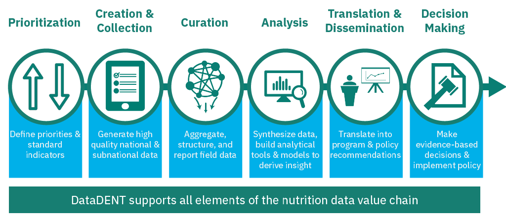
The data revolution requires action across the data value chain to both optimize use of existing data and fill data gaps (see graphic below). A critical component of the value chain is how data is presented to decision-makers, as the human brain processes visuals more rapidly than text (1). As such, visualizations play an important role in facilitating decision-making by presenting data in a way that can be easily interpreted and persuasive in conveying key messages.

There has been a growing number of global data visualization tools (DVTs) in recent years to support countries, as well as to facilitate action and monitor progress towards nutrition targets. To date, little research has been done to understand the collective landscape of DVTs and how they respond to the needs of decision-makers.
Breaking down the DVT landscape in nutrition
We conducted a landscaping of 22 global DVTs displaying nutrition data to examine how they contribute to the nutrition landscape as well as identify best practices and lessons learned on how these DVTs are used to support decision-making. While most of the DVTs selected for this review focus on nutrition, some DVTs included in this review focus primarily on Maternal, Newborn, Child Health, and Nutrition (MNCH&N) like Countdown to 2030 Country Dashboards. Such DVTs were included because they display nutrition data. Additionally, select DVTs from other sectors like the Primary Health Care Performance Initiative and the African Leaders Malaria Alliance scorecard were also reviewed to complement our landscaping in nutrition.
We found that DVTs within the nutrition landscape could be characterized in two key ways.
- There’s a mix of DVTs that cover both single and multiple topics. Specifically, the Global Breastfeeding Scorecard and the Global Fortification Data Exchange (GFDx) DVTs cover single topics, while other DVTs like the UNICEF’s State of the World’s Children Report Dashboard or the Global Nutrition Report (GNR) Country Profiles cover a multitude of topics.
- DVTs generally fall in two non-mutually exclusive categories: accountability DVTs that aim to hold primarily governments accountable for delivering on political commitments such as the WHO Global Targets Tracking Tool; and planning, implementation, and monitoring DVTs that provide support to a broad range of nutrition stakeholders to support countries such as the UNICEF Vitamin A dashboard.
This review of DVTs for nutrition revealed three key insights
1. The broader the theory of change, the less clear the decision you’re trying to influence.
Making data publicly available to development partners and policymakers – or sometimes known as the “build-it-and-they-will-come” approach – is insufficient. Rather, DVTs need an intentional and focused theory of change about what decisions they are targeting and who needs to make those decisions to drive change. For example, African Leaders Malaria Alliance scorecard is often lauded as a successful DVT and in part owes its success to a focused theory of change with a very targeted set of decision-makers (i.e., African Heads of States) it is supporting. An intentional and focused theory of change often includes a strong engagement plan with technical assistance to ensure effective uptake of DVTs by its targeted audience. Many DVTs in nutrition, however, aim to track progress towards global goals, and therefore, have broadly defined theories of change with a wide range of users. As such, there seems to be less clarity around the specific decisions and behaviors these DVTs are trying to change and the pathways that will lead to such change. Our ingoing assumption is that country decision-makers (primarily government officials) need data to support financing, strategic planning, implementation, and advocacy decisions. Global decision-makers – primarily donors and civil society – need data to support their financing, strategic planning, and advocacy decisions to support country stakeholders. Over the coming months, we hope to further unpack the needs of decision-makers through a set of targeted consultations.
2. A growing number of DVTs may lead to confusion as DVTs often cover similar topics but use different approaches.
First, with the exception of nutrition status indicators, DVTs often report nutrition indicators with varying definitions and years – for example, we reviewed Vitamin A supplementation coverage statistics for Nigeria in 2017 and found five different statistics (and accompanying definitions) reported across DVTs. This likely makes it challenging for country decision-makers and their partners to determine which DVT (and statistic) to use to support strategic planning and implementation decisions.
Second, traffic light color coding is an effective visualization for highlighting progress and required action, but the volume of its use across DVTs may be confusing. For example, we reviewed how three DVTs measuring political commitment for nutrition used traffic light color coding to rate the same countries and found that in some cases these same countries were inconsistently rated with red (indicating low progress and high action required) and green (indicating high progress and little action required). Recognizing DVTs use different methodologies, inconsistent traffic light color coding across DVTs may send mixed messages and be confusing for country decision-makers to determine the course of action needed to achieve progress.
3. There is a need for more actionable indicators to drive decision-making.
Outcome indicators like stunting and wasting present the “state of nutrition.” To improve outcomes, actionable indicators are critical for identifying what steps need to be taken to improve those outcomes. Actionable indicators, by and large, are intervention coverage indicators (e.g., zinc treatment for diarrhea) and policy/enabling environment indicators (e.g., government expenditure on key sectors). Unfortunately, DVTs report the same set of limited actionable indicators like compliance with the maternity protection code and IFA supplementation during pregnancy. What’s currently available for actionable indicators is insufficient to support the decision-making needed drive change in countries. There’s a strong need for more actionable indicators to be collected and reported globally – for example, some indicators that would be helpful to track but are not currently available due to lack of data are calcium supplementation during pregnancy or counseling on child growth. Finally, in continuing to drive forward the agenda for more actionable indicators, there could be high value in DVTs displaying indicators without data. For example, the Scaling Up Nutrition Monitoring, Evaluation, Accountability and Learning (SUN MEAL) reports a list of “in progress” indicators which they would like to display but are not yet able to due to lack of data. Displaying indicators without data could be a powerful reminder to nutrition-decision makers to highlight gaps and advocate for the inclusion of indicators in surveys.
Looking ahead for the nutrition community
Overall, our work raises key questions for the nutrition community, which we will continue to explore in the coming months:
How can DVTs better support the needs and challenges of country decision-makers?
- How can DVTs better support the needs and challenges of country decision-makers?
- What are other significant gaps and challenges that need to be addressed to support country decision-makers in making data-driven decisions, especially within resource-constrained environments?
- For DVTs that overlap in either content or audiences, are there ways to coordinate and streamline efforts to increase efficiencies and reduce costs?
We welcome feedback on our work and analysis of DVTs in nutrition and plan to share our full analysis in early 2019. We’re also looking forward to continuing this conversation in Bangkok at IFPRI and FAO’s Accelerating the End of Hunger and Malnutrition conference and at the side event session our team will be hosting called Data Visualization Tools for Nutrition: Empowering Decision-makers to Accelerate Progress on Friday November 30th from 12:15-13:45.
Update: full findings from the global DVT landscaping are available here.
- Evergreen SD. Effective data visualization: The right chart for the right data. Sage Publications; 2016 May 3.
