It is said that “a picture is worth a thousand words.” But how many times have you seen a complicated looking graph on a screen and struggled to interpret it? Data visualization—the process of using graphs and figures to display data—can only be impactful when a target audience can clearly interpret their key messages.
Back in May 2021 we shared our plans to carry out a study to explore data visualization literacy—defined as the ability to read, interpret, extract, and translate information from data visualizations—and preferences among stakeholders working in the nutrition sector in Nigeria. Our goal is to provide evidence that can support the multiple nutrition initiatives in Nigeria that are producing dashboards, scorecards, and other products that use data visualization to support decision making.
Between September 2021 and January 2022, DataDENT conducted an online survey (n=177) and follow-up interviews (n=8) with federal and state level nutrition sector stakeholders in Nigeria. You can read more about methods here.
Key Study Findings
Basic data visualization literacy is high among nutrition sector stakeholders in Nigeria
Respondents were generally able to do the following tasks across the different visualizations presented.
Task |
Example |
Retrieve value from figure |
What is the estimated coverage of [X indicator] in [Year]? |
Interpret trends |
How has [X indicator] changed over time? |
Compare values |
How does coverage of [X indicator] compare to coverage of [Y indicator]? |
Identifying actionable insights from data visualizations remains challenging
Interview respondents experienced challenges with more advanced sensemaking including accurately identifying overall key messages from data visualizations. Some participants described sample data visualizations as “easy” to interpret, but incorrectly interpreted them.
Preference for bar charts and maps but open to innovation
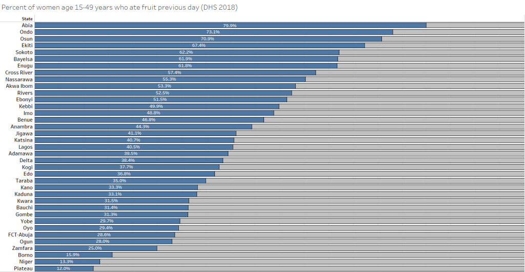
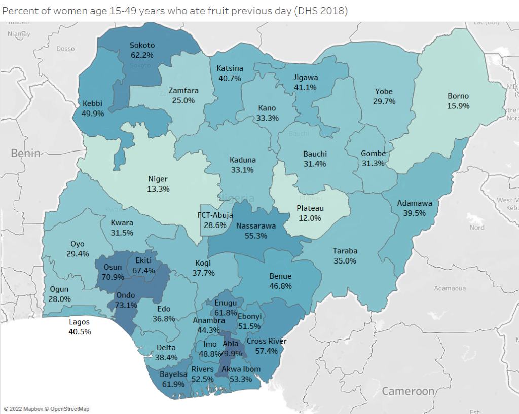
The study included several preference ranking exercises with connected dot plots (also called “equiplots”), which are increasingly being used in global health. Participants overwhelmingly preferred bar graphs over dot plots. Preferences were split between bar chart and map options.
Example: Preferences when visualizing subnational data
Option A – the bar graph – was preferred by 56% of respondents while Option B – the map – was preferred by 44%.

Option A – bar graph

Option B – map
Simple design steps can improve understanding of data visualizations
Study participants followed similar steps when interpreting a data visualization: read graph title, then axes labels, followed by legend titles, and any point estimates labelled. All of these elements should be clearly labeled in a way that supports comprehension. Try to capture the key message for the figure in the title or another annotation to the figure.
Want to visualize your data for diverse nutrition audiences?
Here is what we recommend based on our findings in Nigeria and efforts in similar contexts.
Identify your target audience and communication goals
There is no “one size fits all” approach to data visualization. Always consider your target audience. Is your audience familiar with the topic you want to communicate? What types of data visualizations are they accustomed to seeing?
Prioritize comprehension over aesthetics
Some data visualizations can look impressive but are difficult for audiences to understand. Many of the decision-makers we have collaborated with in Nigeria are most comfortable with basic visualizations: bar charts, pie charts, and line graphs. These preferences also were findings in our previous study on visualizing maternal, newborn, child health data in Tanzania.
This does not mean you cannot use other approaches to visualize data. However, less familiar data visualization types should be accompanied by interpretation guidance. Avoid minimalistic designs that do not include clearly labeled axes, data labels, or data values. These simplified approaches may look “cleaner,” but impair interpretation.
Involve key audiences in the design process
Sharing drafts of data visualizations with someone from your key audience- or even just a friend or colleagues – can be a helpful “check” that your data visualizations are aligned with communication goals.
DataDENT presented the results on 13 October 2022 during Nigeria’s National Nutrition Data and Results Conference 2022 (NNDRC).
Curious about the full results of the study? You can download the brief here.
