Preprint Article | https://doi.org/10.12688/verixiv.1144.1
Date of Publication | July 2025
Abstract
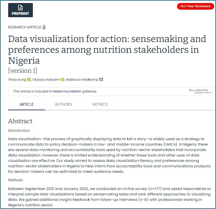
Introduction: Data visualization—the process of graphically displaying data to tell a story—is widely used as a strategy to communicate data to policy decision-makers in low- and middle-income countries (LMICs). In Nigeria, there are several data monitoring and accountability tools used by nutrition-sector stakeholders that incorporate data visualization. However, there is limited understanding of whether these tools and other uses of data visualization are effective. Our study aimed to assess data visualization literacy and preferences among nutrition-sector stakeholders in Nigeria to help inform how accountability tools and communications products for decision makers can be optimized to meet audience needs.
Methods: Between September 2021 and January 2022, we conducted an online survey (n=177) and asked respondents to interpret sample data visualizations based on sensemaking tasks and rank different approaches to visualizing data. We gained additional insight feedback from follow-up interviews (n-8) with professionals working in Nigeria’s nutrition sector.
Results: Most participants correctly answered interpretation questions; however, respondents struggled to identify key messages and actionable insights from the data visualizations. Respondents consistently preferred bar graphs over other formats for most types of data.
Conclusion: To improve comprehension and effective data use it is important to tailor data visualizations to the literacy and preferences of the target audience. More guidance is needed on how to assess data visualization literacy.

