Given the recent upheaval due to the COVID-19 pandemic and adjustments needed in planning, targeting, and implementation of programs, data is more important than ever before. In nutrition, we have seen a proliferation of global data visualization tools (DVTs). Data visualization aids audiences in interpreting data and focusing on key priorities (Evergreen, 2016). For example, nutrition advocates frequently include visualizations from DVTs in briefs for policymakers to call attention to nutrition issues and make the case for increased investment.
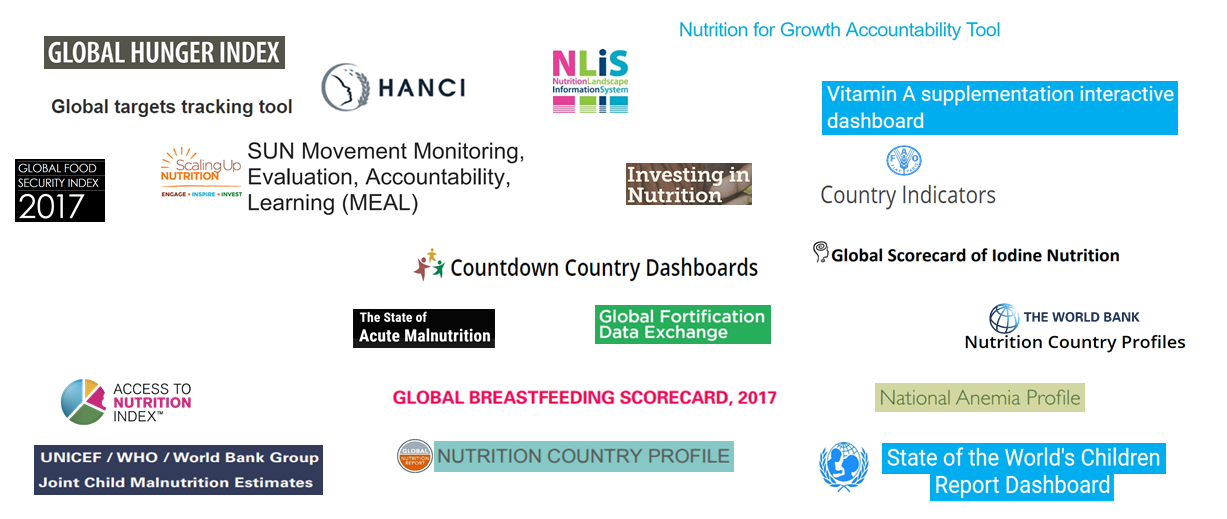
Data for Decisions to Expand Nutrition Transformations (DataDENT) conducted a landscaping analysis of these tools in 2018 and found that there were at least 22 active global nutrition DVTs and this number is only increasing (Figure 1). The focus of these tools ranges from very specific subject areas, such as the Vitamin A Supplementation dashboard, to a broad overview of nutrition status, like the Global Nutrition Report (GNR) country nutrition profiles.

A key finding from this analysis was that DVT producers need a strong engagement plan to entice the target audience to use their tools. To date, however, there is little information available on how users engage with data visualization in public health and nutrition (Aung et al., 2019).
In July 2020, DataDENT conducted user research with 31 individuals from 22 global and regional organizations to explore how stakeholders engage with global nutrition DVTs. Respondents were from a mix of civil society organizations, donors, regional bodies, academia, and United Nations agencies. We unpacked how existing global nutrition DVTs are being used, identified strengths and challenges in using DVTs, and sought to understand how the use of specific DVTs is constrained by nutrition data availability and quality.
Based on our findings, we recommend three ways for global nutrition DVT producers to facilitate better engagement with their users.
1. Conduct user research on your DVT to understand how different users interact with your tool.
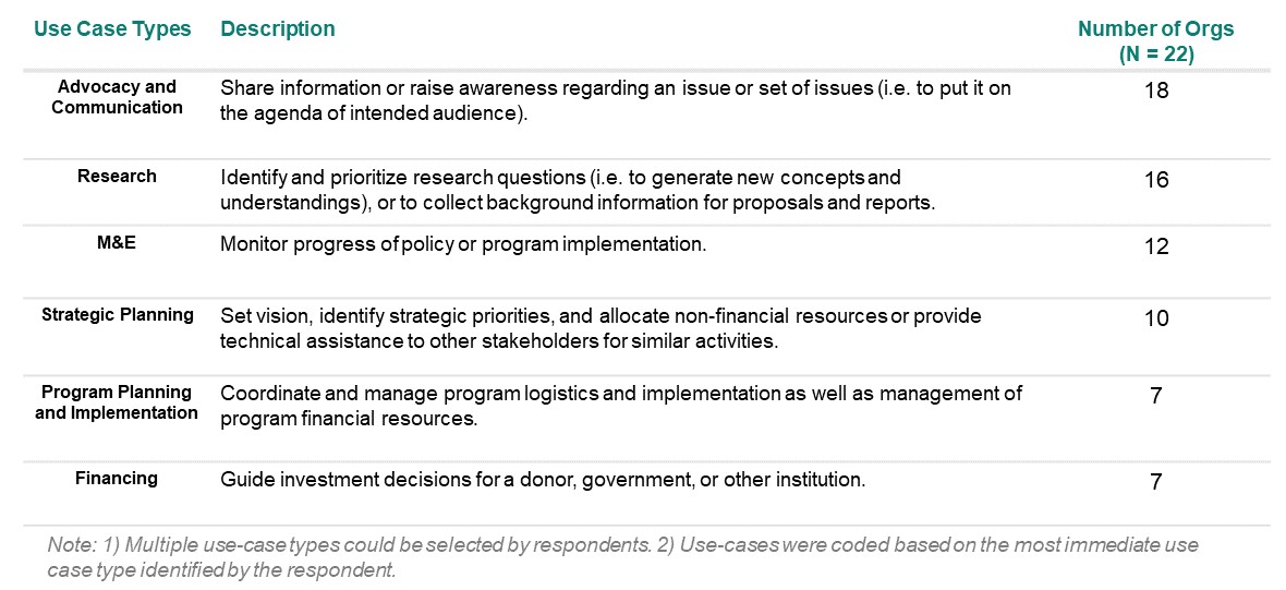
During our research, we asked respondents to identify which use-cases of global nutrition DVTs applied to people working across their organizations. Use-cases varied by organization type, in some cases because organizations have different mandates. Respondents most commonly use DVTs for advocacy and communication, research, and monitoring and evaluation (Figure 2). Since DVTs are used in varying ways, producers must be guided by a clear theory of change around how the intended audience will use their DVTs.

As part of their user research, producers should test visualization formats to understand the preferences of users. We discovered that a tool’s ease of use, functionality, and aesthetics are of great importance to respondents. For example, a respondent from a donor organization appreciated the UNICEF/WHO/World Bank Group Joint Child Malnutrition Estimates dashboard (JCME) and GNR because of their “fundamental interface and how easy to use they are.” Respondents also favored DVTs that were interactive, such as a representative from a civil society organization/international non-governmental organization (CSO/INGO) who liked the State of the World’s Children dashboard because she could “select regions and countries…[and] make some comparisons.” Another respondent from a CSO/INGO highlighted that DVTs “need to look pretty” to be useful, suggesting that users appreciate visually appealing tools.
Another question to explore during user research is which indicators are needed by the primary audience to spur action. The respondents in our study consistently appreciated tools that collated the necessary data related to their subject of interest. They also emphasized that some critical indicators, particularly on coverage of interventions and nutrition financing, are lacking across many tools. As an example, a respondent at a research institute noted that he had often accessed DVTs and “wished for more information on coverage.”
2. Be transparent on where the data has come from, any re-analysis of the data, and assumptions. Quality of data is of paramount importance to the perceived credibility of your tool.
Respondents identified certain steps that DVT producers can take to improve the perceived credibility of their tool. Producers should ensure that the metadata is available, and any assumptions, caveats, or re-analysis of the data are made transparent. One user from a CSO/INGO emphasized that missing metadata was an issue across many DVTs and highlighted that knowing the “indicator name, full definition, type of data… and method of estimation…is really useful and is not always clear from sources.” Respondents also appreciated DVTs that included clear links to the underlying source data within the metadata. This transparency improved user confidence in the credibility of the tool.
Respondents gravitated toward DVTs that are well-known for their transparency and perceived credibility. One respondent from a UN agency regularly uses the JCME because it is “UNICEF’s official number” and he knows “that the vetting process behind it makes it reliable.” On the other hand, a user from a donor organization claimed she would not use the UNICEF NutriDash tool because she doesn’t “understand the methodology behind it and the limitations…in terms of interpreting the data.”
3. Strengthen the capacity of users by training users, engaging users, and creating a narrative for non-technical audiences.
For many users, especially those who are not familiar with the technical aspects of nutrition data, a complex visualization can be quite daunting. One DVT user from a CSO/INGO noted that “for [a] tool to be effective, the tool needs to speak to different audiences who may not be as well-versed in finance or statistics.” To engage these users, producers should provide training, such as pre-recorded tutorials and webinars, and non-technical narratives on how to use the DVT and interpret the visualizations.
Respondents were also more likely to use tools where they felt more engaged with the producer. A respondent from a CSO/INGO mentioned that a “presentation on key pieces of data” led by the producers of the JCME was very helpful in responding to her needs. This favorable attitude towards producer engagement applied not only to DVTs but more broadly to nutrition data. For example, a user recommended that nutrition data producers hold “some training…whenever new analysis comes out,” regardless of whether the data is translated into a DVT or not.
Looking ahead
With a growing number of global nutrition DVTs, producers need to pause and think critically about how their tools are being used. These recommendations from DVT user research complement the findings from DataDENT’s prior landscaping of global nutrition DVTs — particularly the importance of understanding the target audience and including actionable indicators. Although we acknowledge that country-level users may engage with DVTs differently from users at the global level, we believe that many of these findings could apply to the country level as well. These key learnings echo DataDENT’s country-level experience, such as the landscaping of India nutrition DVTs, and the support that DataDENT is providing the Nigeria Governor’s Forum to develop a nutrition scorecard. Full findings from this user research are available here.
We now open this discussion to you. Do these findings resonate with your experiences using global nutrition DVTs? Are there other factors that producers should consider for improving the effectiveness of their tools and ultimately improve the use of nutrition data?
Acknowledgments
We are grateful to Augustin Flory at Results for Development, and Rebecca Heidkamp and Tricia Aung at Johns Hopkins School of Public Health for their thoughtful comments. We would also like to thank the 31 respondents we interviewed for sharing their time and experience with us.
Citations
[1] Aung, T., Niyeha, D., Shagihilu, S., Mpembeni, R., Kaganda, J., Sheffel, A., & Heidkamp, R. (2019). Optimizing data visualization for reproductive, maternal, newborn, child health, and nutrition (RMNCH&N) policymaking: Data visualization preferences and interpretation capacity among decision-makers in Tanzania. Global Health Research and Policy, 4, 4. https://doi.org/10.1186/s41256-019-0095-1
[2] Evergreen, S. (2016). Effective Data Visualization: The Right Chart for the Right Data. Sage Publications.
