
Moving multisector coordination from theory to practice is complex, and it is important to learn from country experiences. A multisector nutrition information system (NIS) supports coordination by synthesizing data from diverse data sources and across different sectors to provide actionable information for local, national, and regional actors.
Ethiopia was one of the first Scaling Up Nutrition (SUN) countries to design and scale a routine multisectoral NIS. The Unified Nutrition Information System for Ethiopia (UNISE) tracks program implementation across several sectors that contribute to the national Food & Nutrition Strategy, and the Resource Tracking and Partner Management tool (RTPM) tracks resources and partnerships that support multisector nutrition programming. DataDENT is one of several partners working with Ethiopia’s Seqota Declaration Federal Program Delivery Unit (SD F-PDU) to support the scale-up of these two information systems.
In 2023, the F-PDU shared concerns about the utilization and quality of the UNISE and RTPM in the 203 and 66 woredas where the two systems are operational, respectively. Formal documentation of the two systems was limited, so we began by mapping the flow of data from the source into each system from two different perspectives: 1) one that captured how key stakeholders currently experience the systems and 2) one that captured how systems were designed to function by the F-PDU.
First, we interviewed UNISE and RTPM users across administrative levels and synthesized their responses into the process maps that captured how stakeholders experienced the systems, using the data value chain framework. These process maps reflect how the systems are currently operating based on the respondents’ reports. We used color coding to communicate the level of agreement among respondents and data saturation. Green boxes are steps where respondents agree about data system functioning. Yellow and orange boxes are steps where there is less corroboration between respondents, and there may be confusion about or variation in how the data systems operate. An example of this type of process map is displayed below.
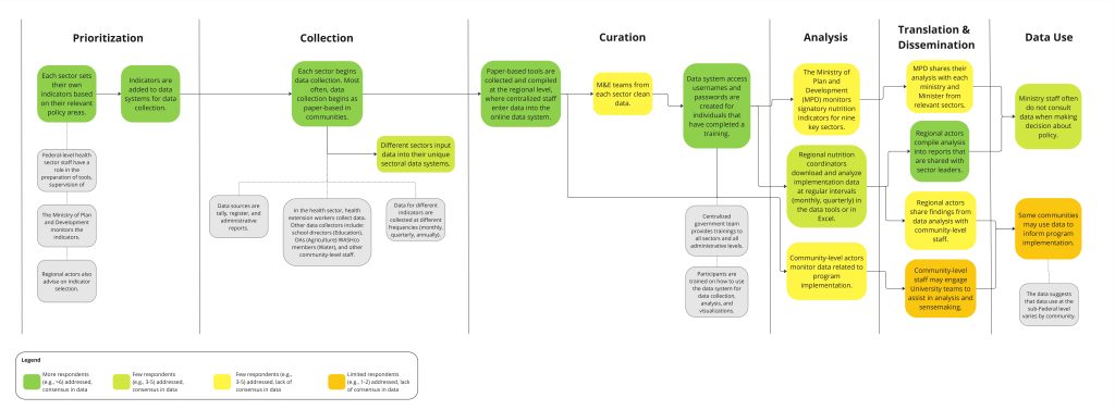
Figure 1: Process map as stakeholders experience the system
One insight that came up through this process map, as an example, was that while respondents agreed that sector leaders at the federal and regional level conduct data prioritization, the process maps uncovered a lack of clarity around how data from UNISE and RTPM is analyzed and shared. Respondents had varied information about who conducts data analysis, when and how this analysis is completed, and how analysis is disseminated to decision makers.
Second, the DataDENT team collaborated with the SD F-PDU to create another set of process maps that documented how each data system was designed to operate. Color coding in this process map represents the administrative level at which each activity occurs. An example of this kind of process map is displayed below.
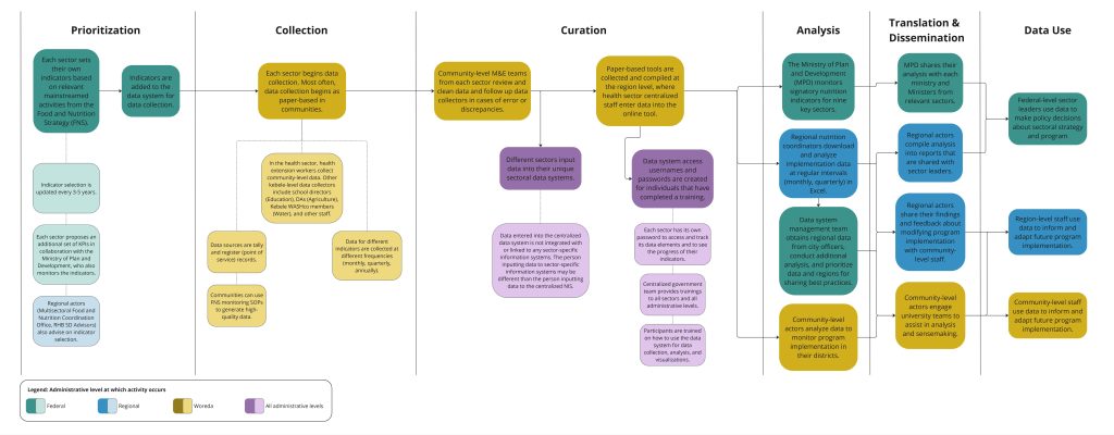
Figure 2: Process map as system was designed to operate
Building on the previous example, when the F-PDU was asked about how they expected analysis to be done using UNISE, they suggested that federal, regional, and woreda-level staff should conduct simultaneous data analysis. Then, federal and regional staff would share findings with federal sector leaders to inform policy and program implementation guidelines, while regional and woreda staff would use findings to inform and adapt service delivery.
How can these process maps support information system scale-up?
For our work with the Government of Ethiopia, DataDENT is using the process mapping outputs to decide how to best design and target capacity-strengthening activities to improve the implementation of the UNISE and RTPM. We are developing a costed capacity strengthening plan recommending training, mentorship, and other activities for different actors. Two specific examples of how we are doing this include:
Identifying inefficiencies in the system: While data system managers and users may be aware that data is not informing decision-making, it can be difficult to identify what parts of the data process are not operating well. When comparing the two process maps, researchers or data system managers can identify which parts of the data system process are not aligned. Those misaligned areas can indicate opportunities for capacity strengthening and, possibly, changes in the design of the systems. It can also highlight areas of success where data systems are operating as designed. Lessons from these areas of success can be used to strengthen weaker portions of the system.
Strengthening communication of Multisectoral Food and Nutrition Monitoring and Evaluation (M&E) Standard Operating Procedures (SOPs): Process maps can be used by central data system managers to clarify their team’s understanding of the system. They identify the different roles involved in UNISE and RTPM implementation and show how their contributions feed into large-scale results. This is particularly useful during training and in guidance materials such as Multisectoral Food and Nutrition M&E SOPs.
Follow DataDENT on LinkedIn, Bluesky & X to learn more about our efforts to support strategic planning, financing and capacity strengthening for stronger nutrition data value chains in Ethiopia.