Dot Plot/Equiplot
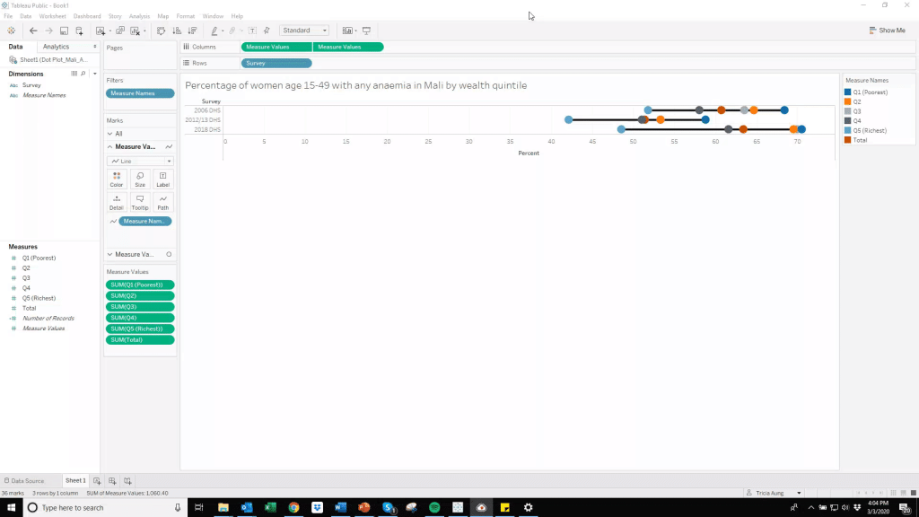
Dot Plots are useful for emphasizing gaps in estimates among different groups. We often want to disaggregate nutrition data by groups like wealth, residence, and sex to explore inequities. Estimates are plotted on a common axis, which helps our brains interpret gaps among estimates. Because dot plots are helpful for visualizing equity, University of Pelotas International Center for Equity in Health calls these “equiplots.”
Data for Tutorial
Click here to download the Dot Plot tutorial data file. This data is from The Demographic and Health Surveys Program.
Making Dot Plot/Equiplots
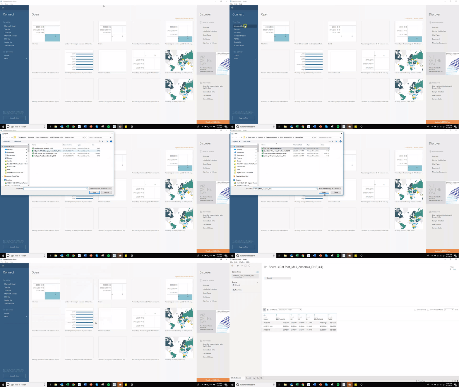
Step 1: Connect data to Tableau Public.
• Load sample data file by clicking on “Microsoft Excel” in the Connect panel within the Tableau Public home screen.
• Select the file named “Dot Plot_Mali_Anaemia_DHS.xlsx” downloaded above.
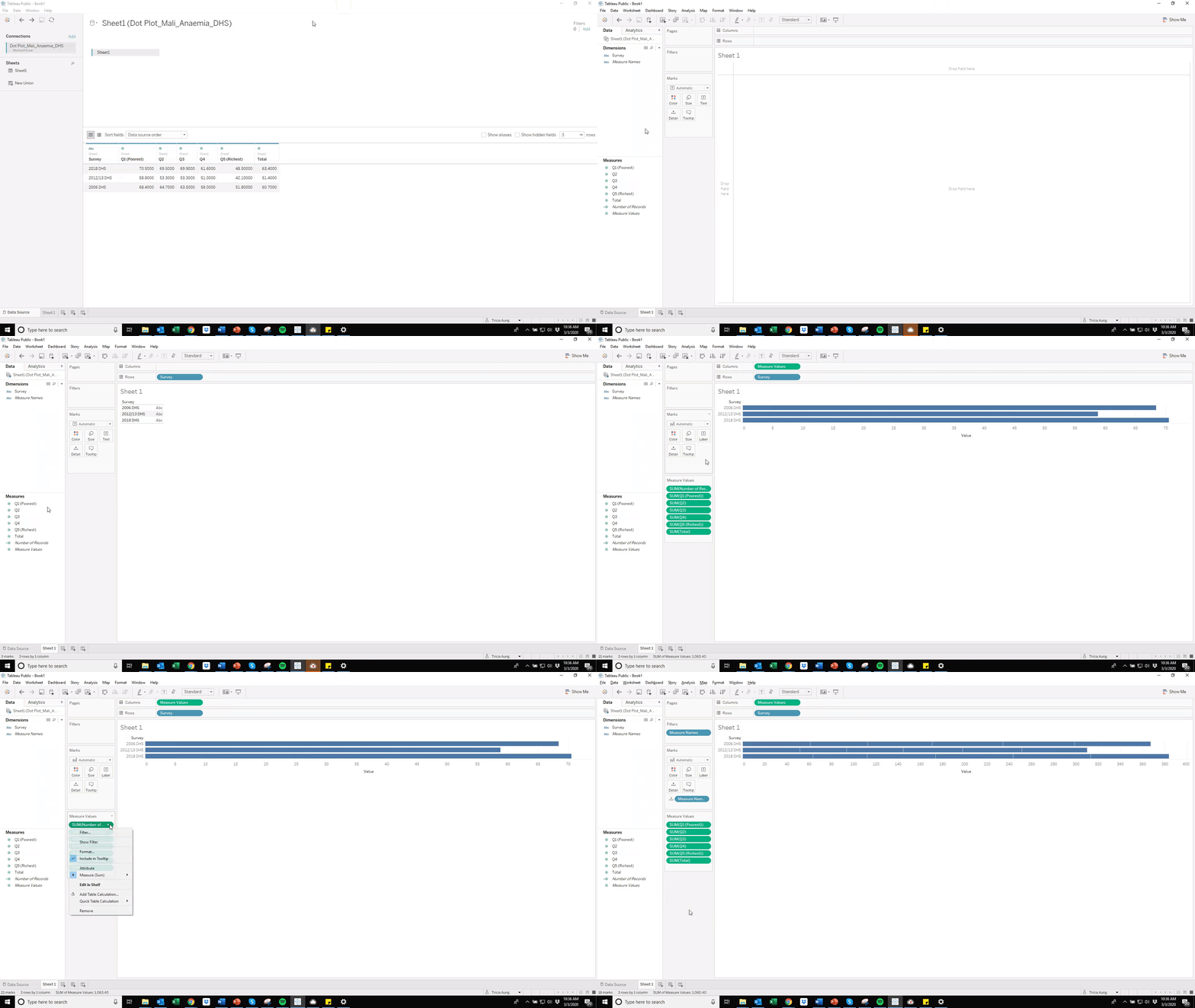
Step 2: Assign data.
• Click on the worksheet tab at the bottom of the screen. You will build your data visualization within this worksheet.
• In the Dimensions section, drag “Survey” to the Rows field. In the Measures section, drag “Measured Values” to the Columns field.
• In the Measure Values section, click the down arrow in the “SUM (Number of Records)” and select “Remove.”
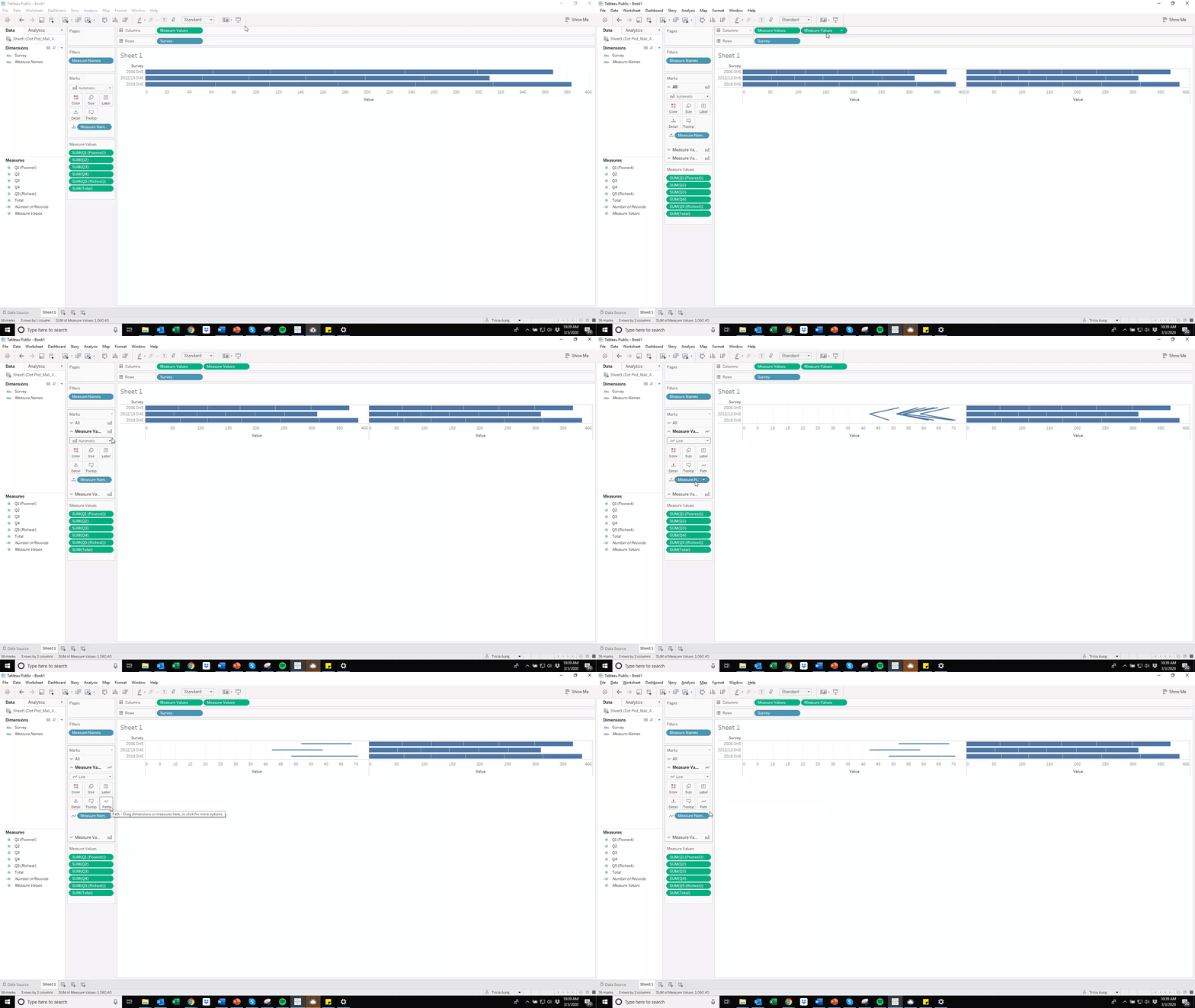
Step 3: Create lines and circles.
• While holding the “Ctrl” key (PC) or “⌘” key (Mac), click on “Measure Values” button in the Columns field and drag the button next to the existing “Measure Values” so that there are two “Measure Values” buttons.
• In the Marks section, click on the first “Measure Values.” Click the down arrow next to the default “Automatic” setting and select “Line.” Drag the “Measure Names” button to the “Path” button.
• In the Marks section, click on the second “Measure Values.” Click the down arrow next to the default “Automatic” setting and select “Circle.” Drag the “Measure Names” button to the “Color” button.
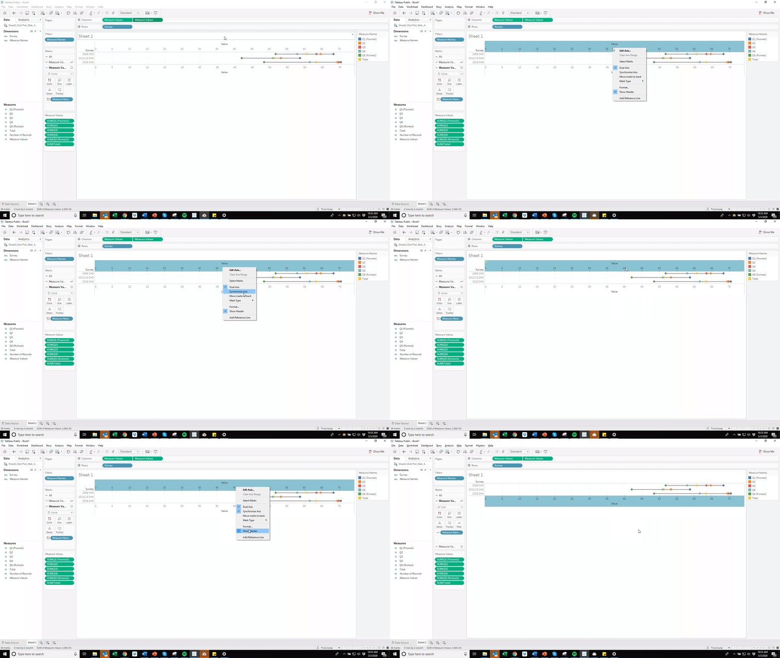
• Click the down arrow next to the second “Measure Values” in the Columns field. Select “Dual Axis.”
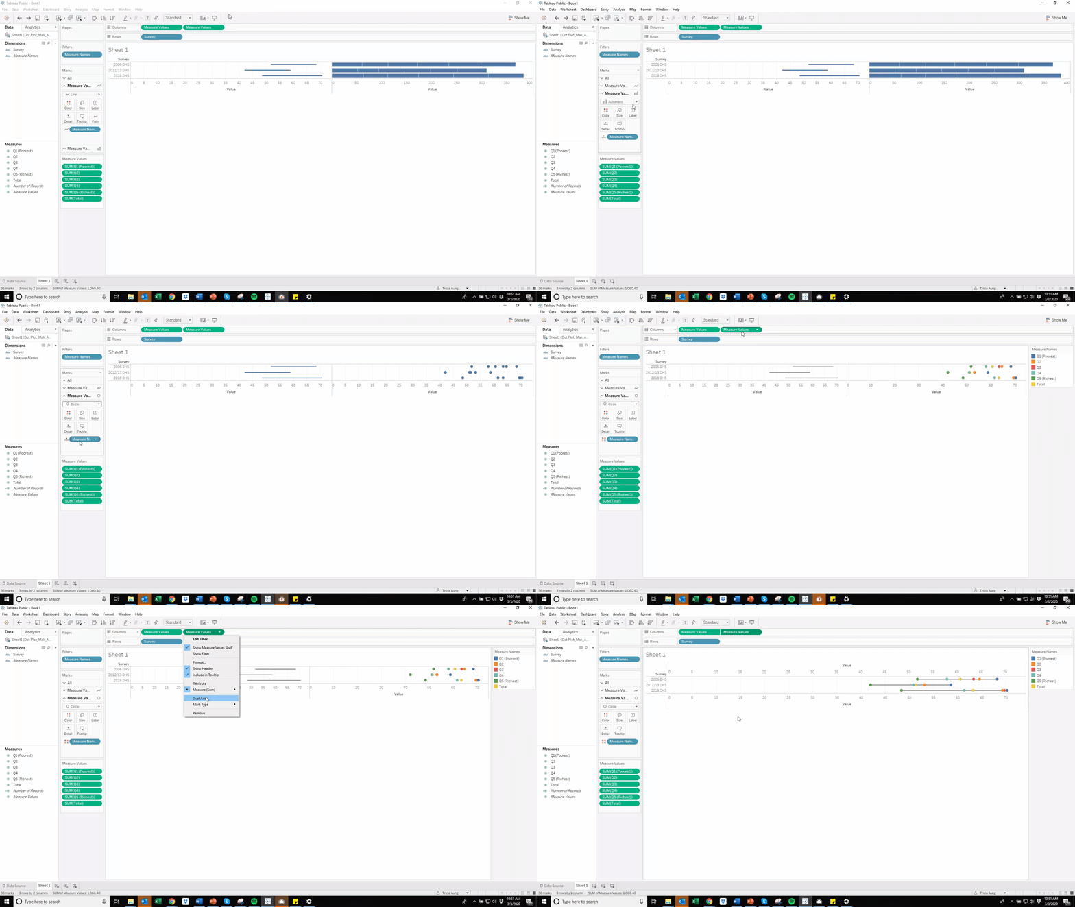
Step 4: Format axes.
• Right click the top horizontal axis (PC) or hold the control key while clicking on the top horizontal axis (Mac) and select “Synchronize Axis.” Deselect “Show Header.”
Step 5: Add titles.
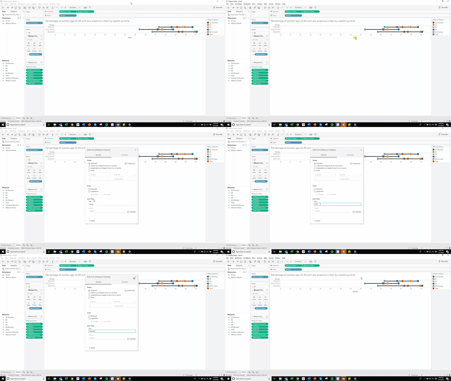
• To specify a title for your data visualization, double click “Sheet 1.”
• To change an axis title, double click on the existing axis title.
• To change the legend title, click the down arrow next to the current legend title.

Formatting Tips
Changing Colors
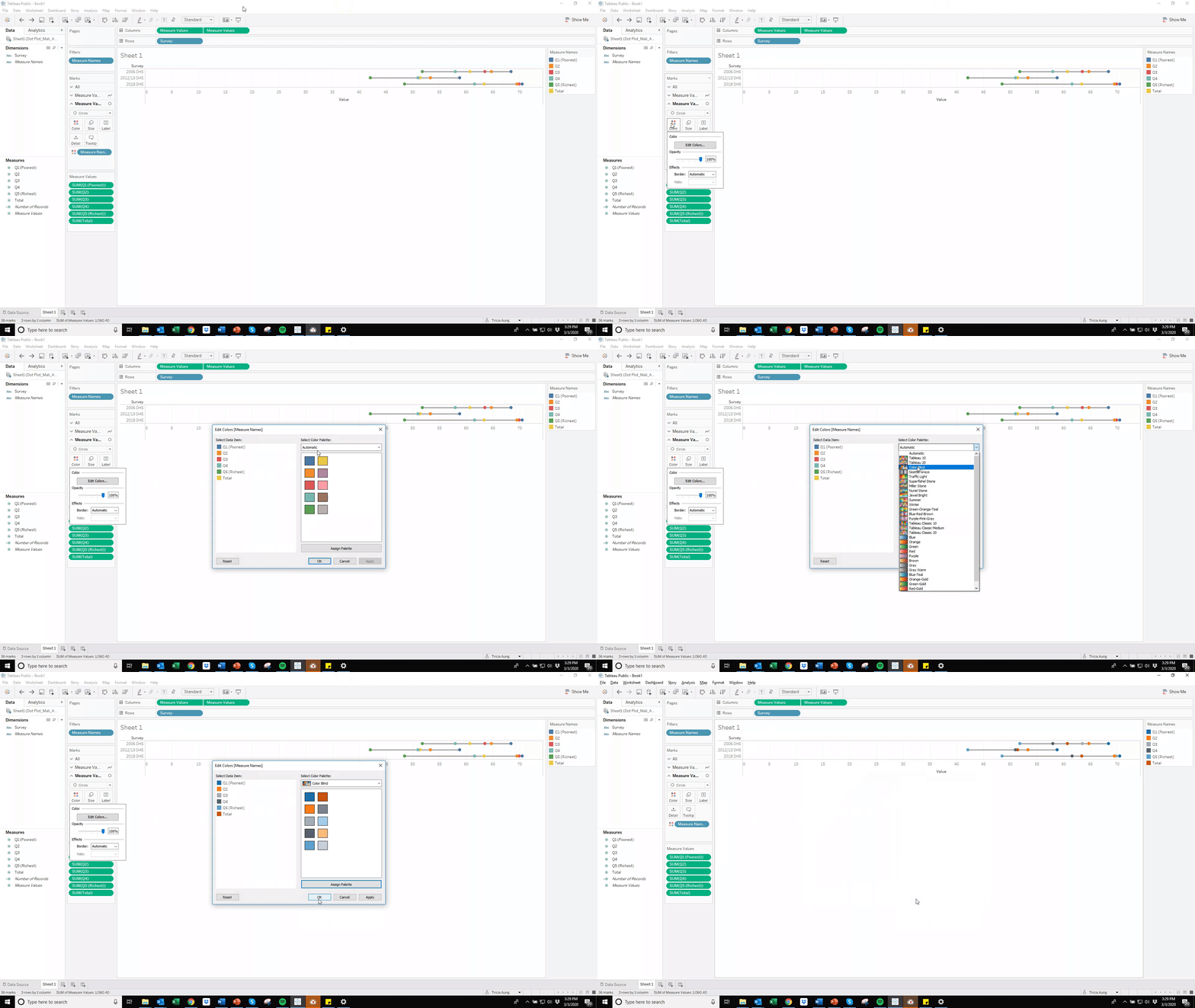
In the Marks section, click the “Color” button within either the line or circle “Measure Values” to change colors of lines or circles.
Changing Line Width/Circle Size
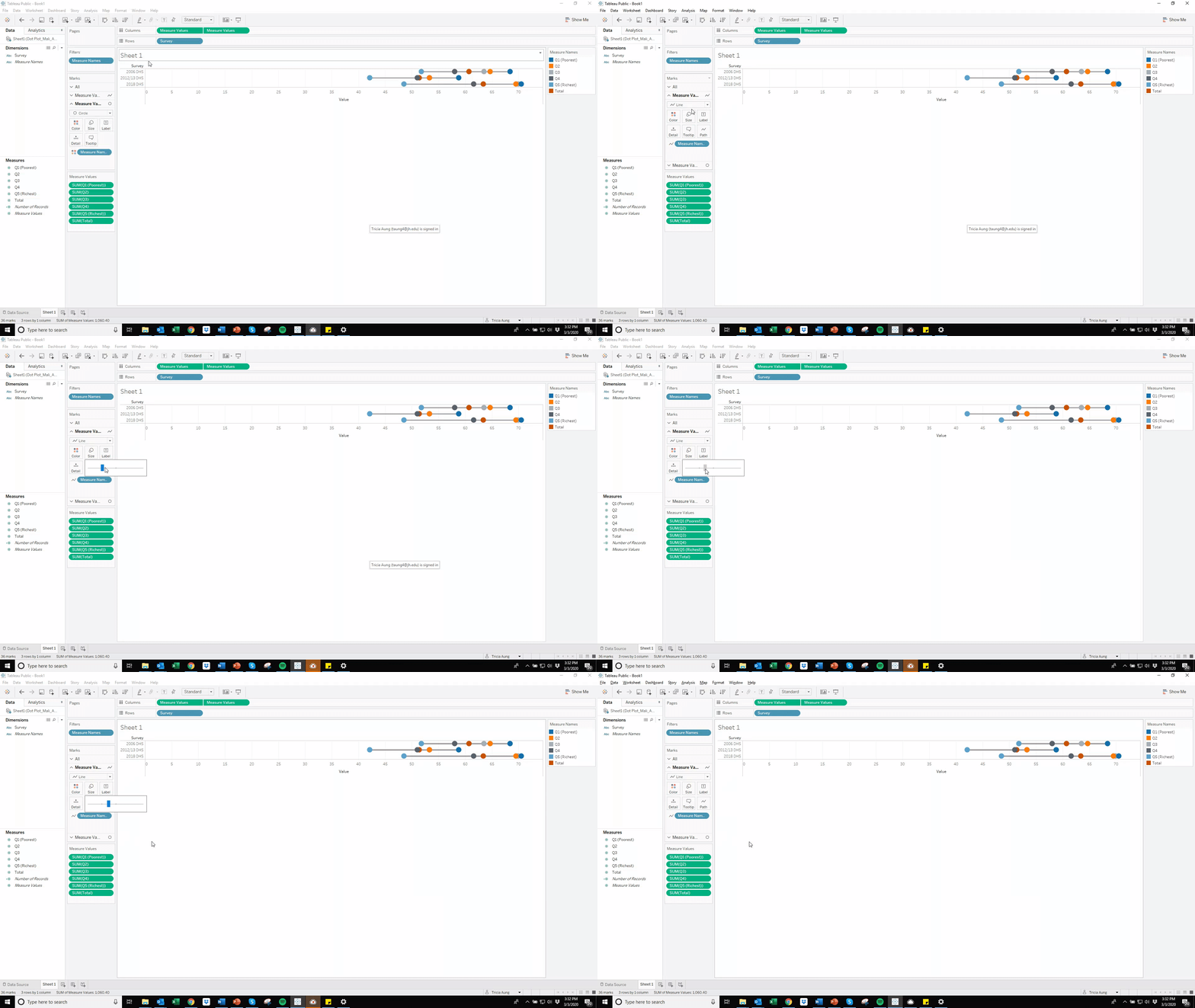
In the Marks section, click the “Size” button within either the line or circle “Measure Values” to change colors of lines or circles.
Saving Your Worksheet to Tableau Public
Click File, “Save Workbook to Tableau Public.” Your data visualization will be published to your Tableau Public account, which will open within your web browser.
Downloading and Sharing Your Data Visualization
While your data visualization is open in your web browser, click on the rectangle/arrow button (second button from the right) at the bottom to download your data visualization.
Click on the dots/line button (third button from the right) to get a direct link to your data visualization or download embedded code to place your data visualization on a website.

Links to DataDENT Tableau Tutorials
If you have any questions about these tutorials or would like to share your Tableau Public creations, please contact Tricia Aung (taung4@jh.edu).
